Workplace Elements Website
Reestablishing brand integrity and better UX
UX UI DESIGN
the problem
While Elements has beautiful branding, their current website was not reflective of the beautiful spaces they create. The company is very integrated as their culture reflects their product, but this was not conveyed in the current website.
too much focus on individual products vs overall space design
brand confusion - “what does this company do?”
gorgeous photos were under utilized
company culture was not represented well
navigation was confusing
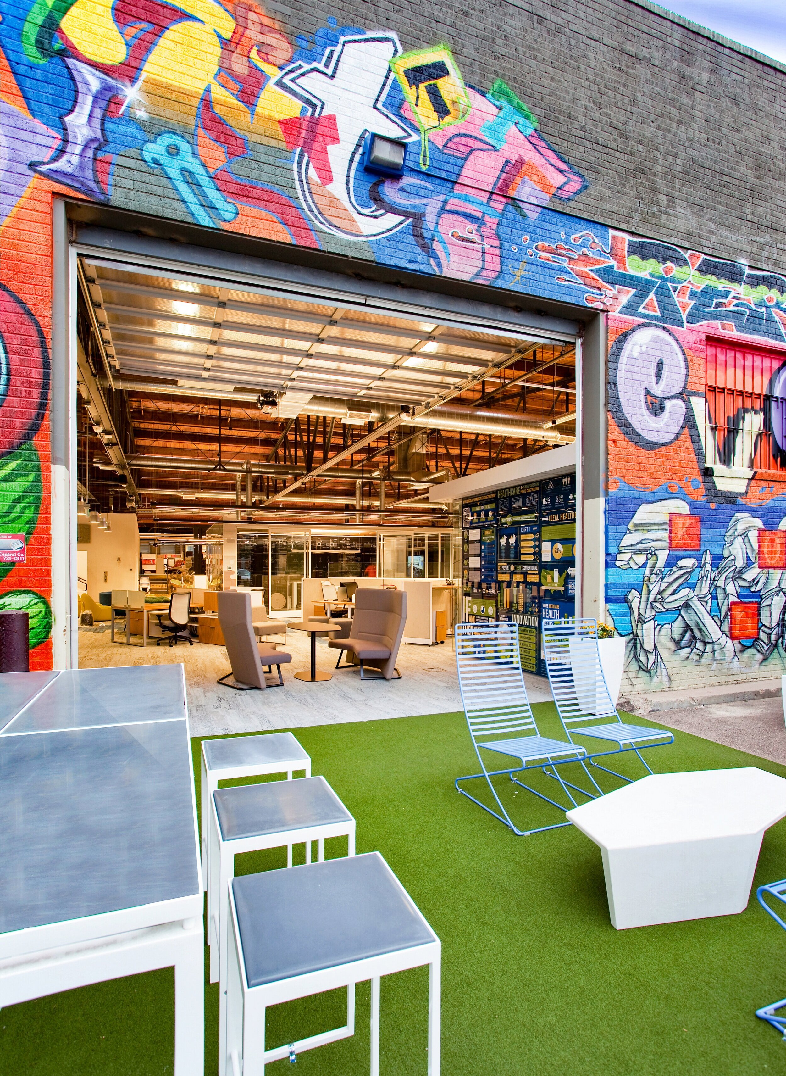
their spectacular showroom was not represented
was not clear which markets they serve (national)
the solution
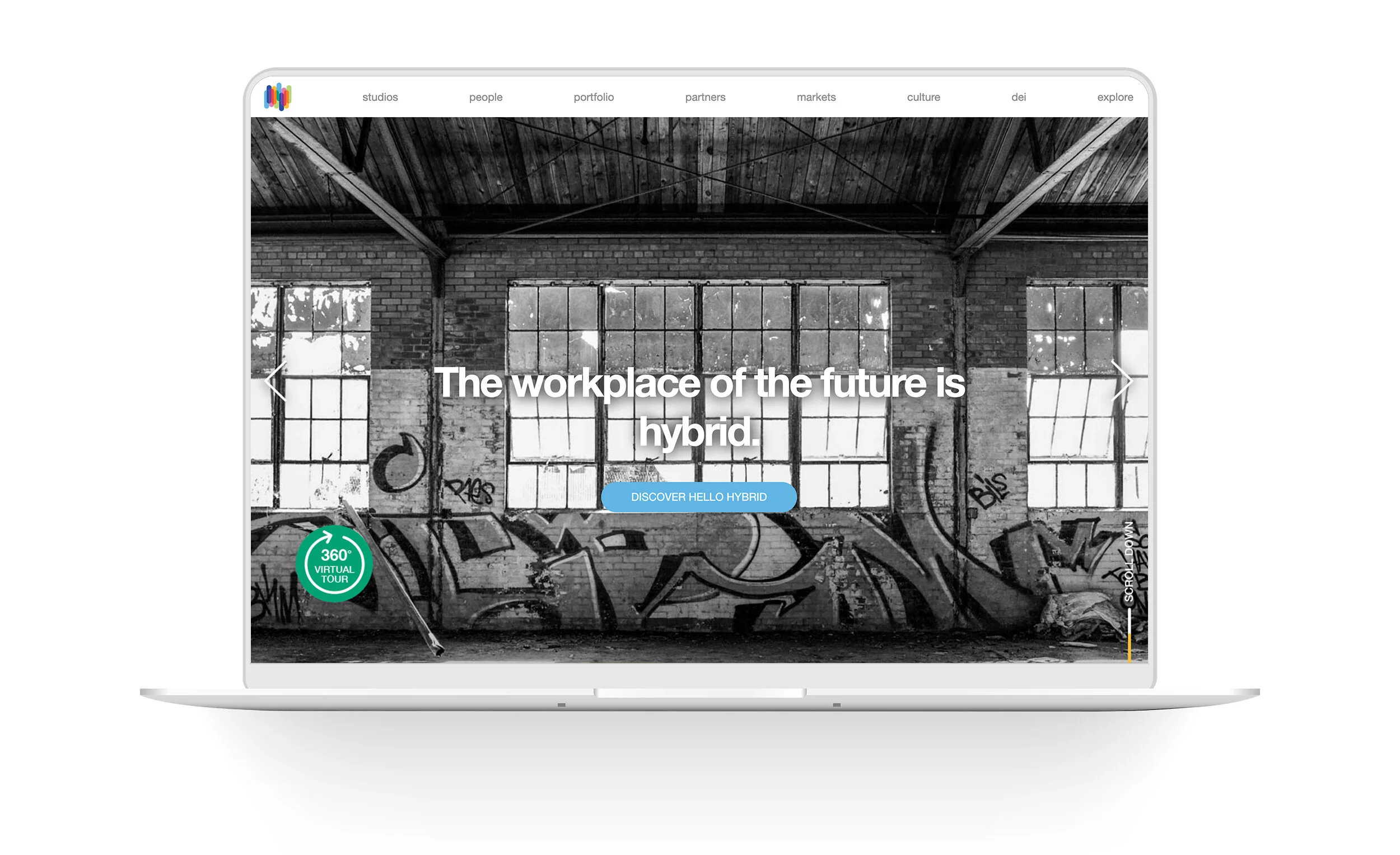
Create a fully responsive website design for workplacelements.com, a company that designs workspaces for business that are conducive to inspiration, productivity and connection. The new website should evoke creativity and inspire. It should reflect the company culture and make good use of their gorgeous imagery to tell the story. It will be clear that they do not sell products, but design spaces. Easier navigation. Adding a 3D walkthrough of their showroom, where the user can explore the different product offerings. A map representation of their markets (they are not just in Colorado)
the research
After meeting with the partners it was clear to me that Elements is a company that knows how environment affects one’s state of being, and strives to inspire and enhance the lives of others. They are aware how the layout of a space can bring ease. How technology can enhance efficiency. How art can inspire creativity. Most importantly, they are aware of how each of these elements creates the Whole, the overall ‘vibe’ of a space. Elements applies this knowledge to their products AND their company culture. Each person is essential to the whole. Each person has a role that contributes to the collective. Each person/element comes together to create something bigger than themselves.
They wanted the site to reflect the brand and the integrity of the company, and have a better user experience, given the large amount of content. And they wanted to give their gorgeous showroom an online presence.
This lead me to research:
proper UX strategies to organize a large body of content
representation of company culture within a site
web designs with an emphasis on color and imagery
local competitors online presence
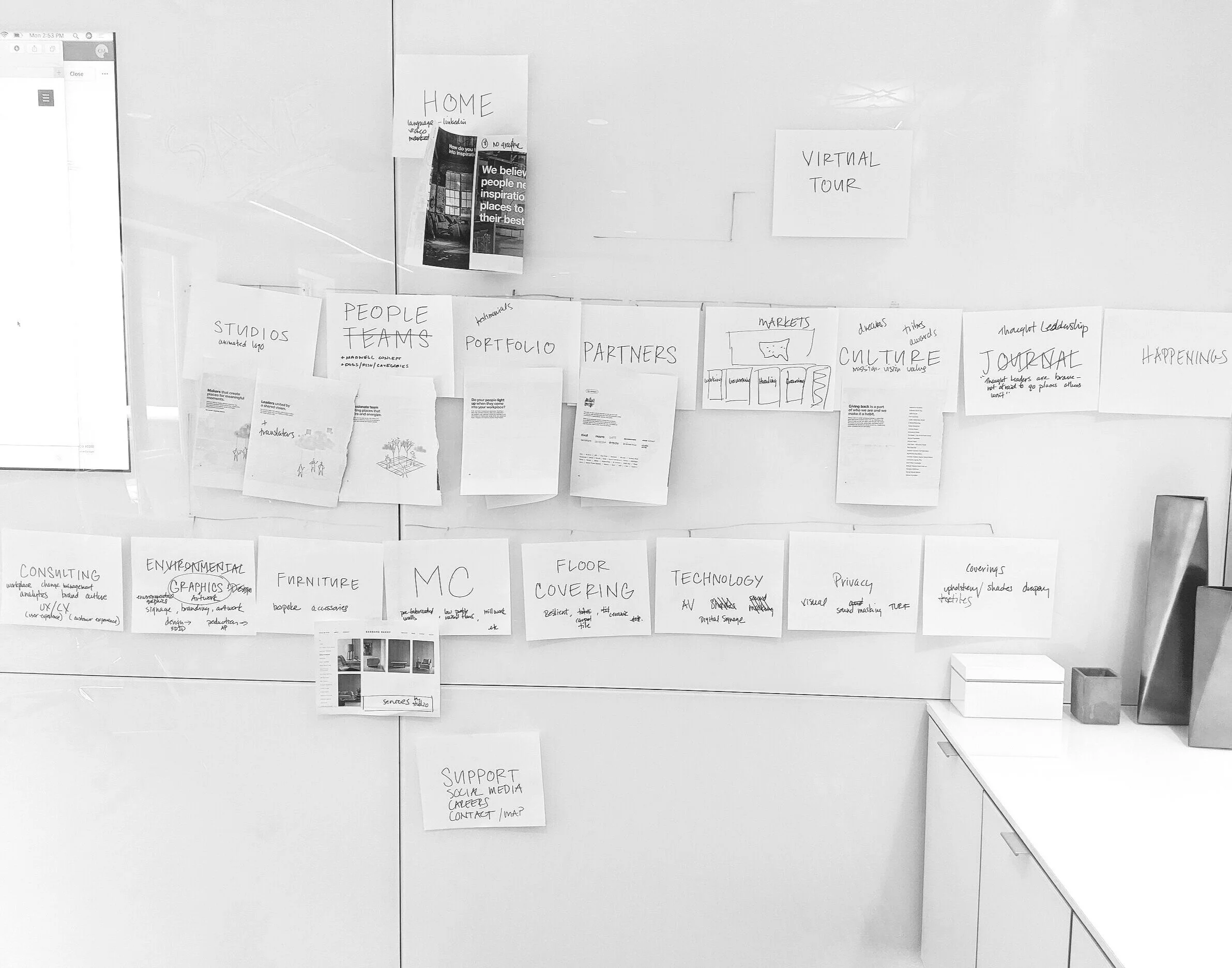
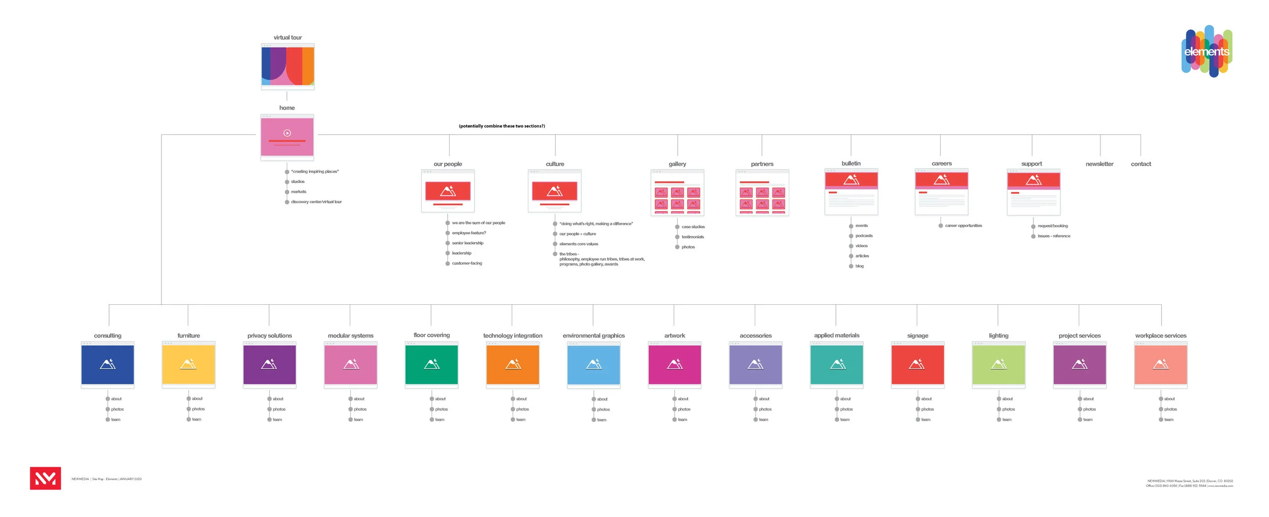
sitemap
Given the amount of content, the sitemap was where we began.
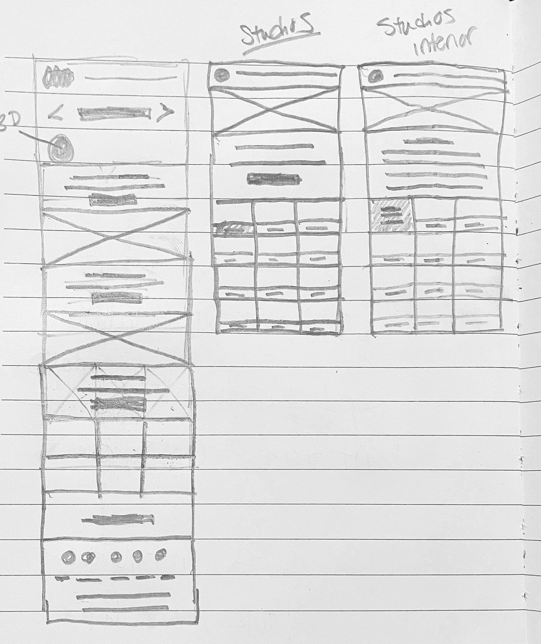
sketches
Quick sketches to determine the overall flow while talking with clients. Nothing glamorous, but part of the process nonetheless!
style guide
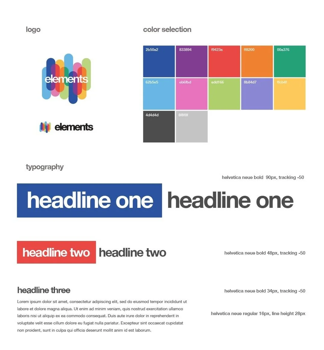
I create a style guide for the site, specifying fonts, colors and overall style. This helps the client sign off on an overall look and feel and serves as a guide for the developer.
wireframes
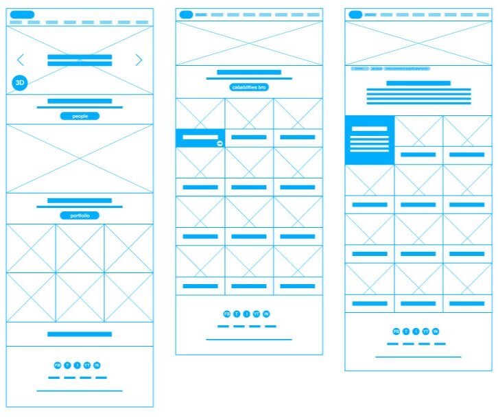
I then take my notes to lo-fi wireframes to show the general structure and overall flow of the site. This also serves as a foundation so the client knows where we need copy and images.
photoshop mockups
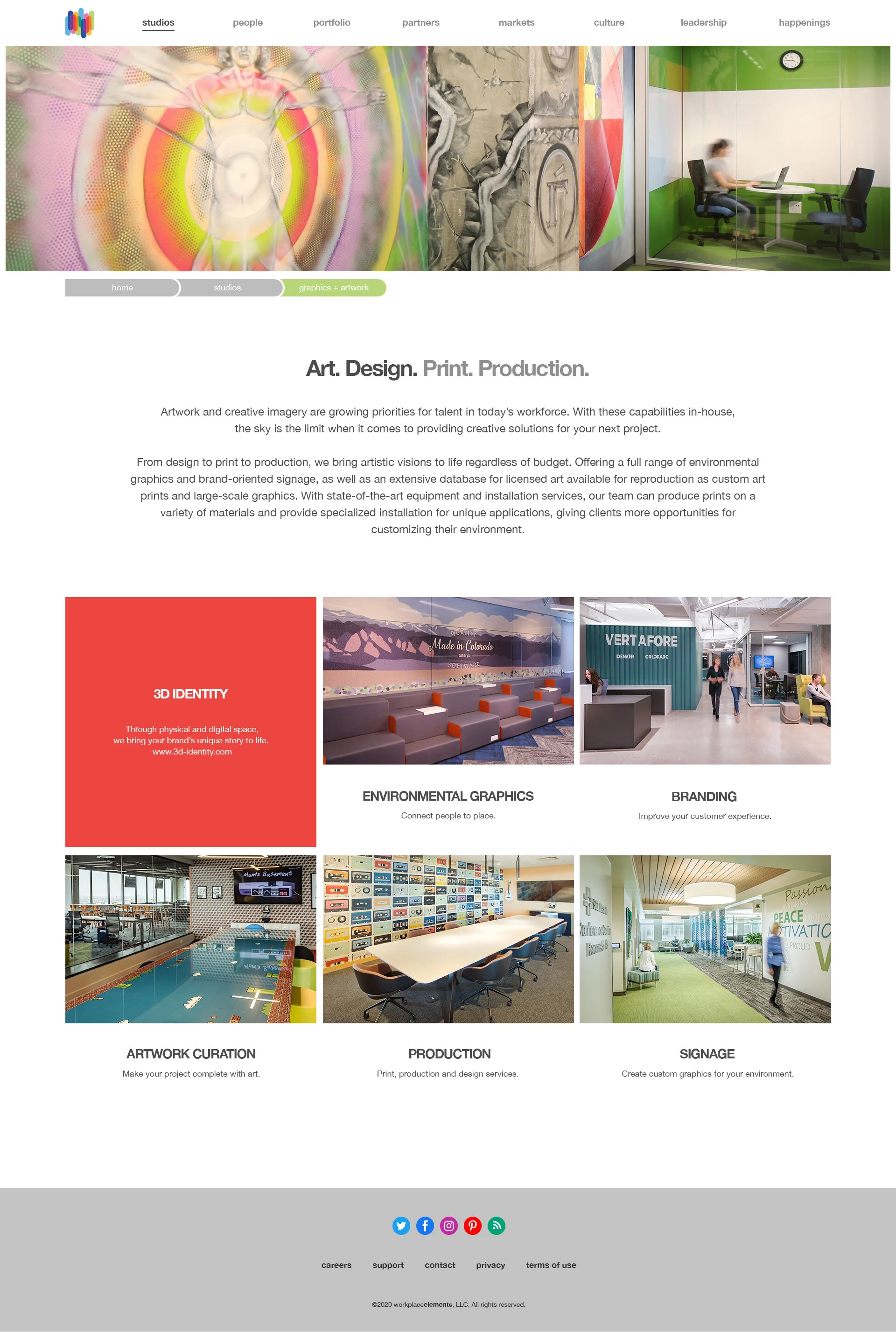
I then take my designs into photoshop, presenting mockups to the client before passing to development. This further demonstrates the functionality to both the client and development.

