Emergenetics Website
Drive leads, improve SEO and modernize the vibe
UX UI DESIGN
the problem
While Emergenetics has a compelling product, its current site was doing a disservice with confusing navigation - too many decisions/clicks for the user and the purpose of the product was unclear. They needed a clean, modern site with a new information architecture.
not driving sales leads
too many clicks/decisions
unclear what the product is and benefits to the user
content inconsistent with brand messaging
no storytelling
not ADA & GDPR compliant
unclear how to become certified
needs to be translated in at least eight languages
needs login portal
the solution
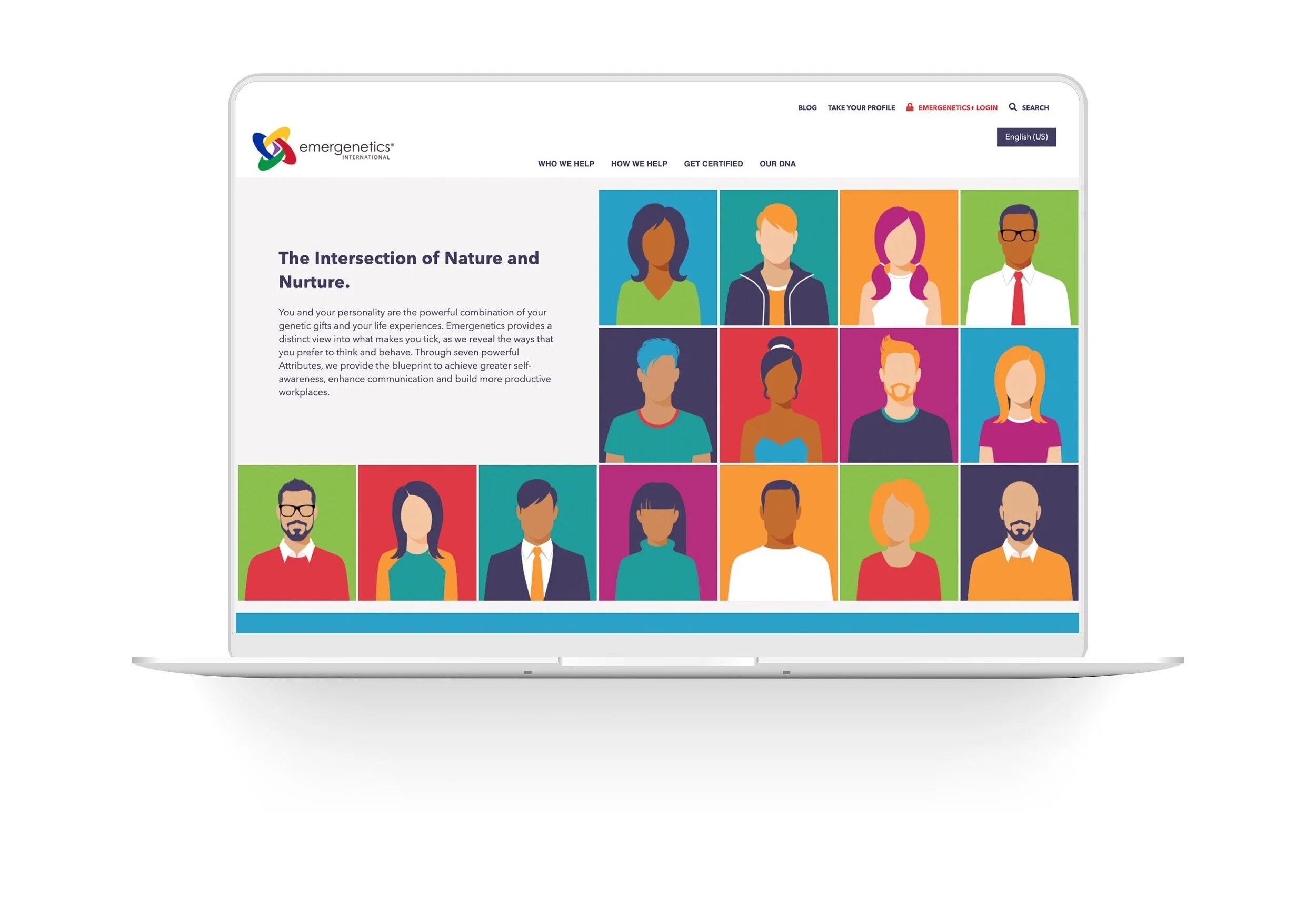
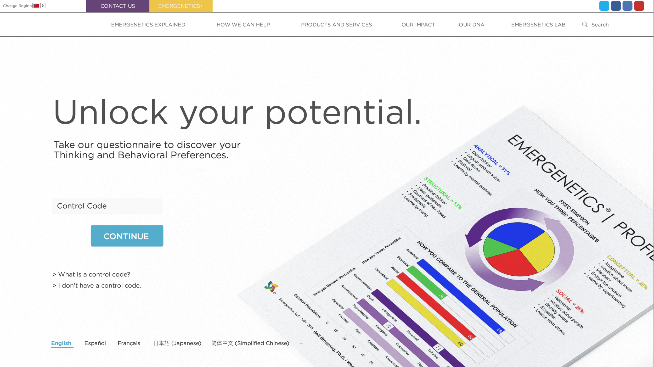
Create a fully responsive website design for emergenetics.com, a company that empowers employees by revealing individual attributes to achieve greater self awareness, enhance communication and build more productive workplaces. The new website should clearly show the process and its offerings. It should reflect the brand messaging and be easy to navigate. Users will be able to easily complete an assessment, connect with sales and register to become certified. The site will be clean, clear, inclusive and trustworthy.
the research
Before meeting with the Emergenetics team, our team each took a profile assessment. We then did a full session with Certified Leader, learning about our particular personalities and how we can work best as a team. So cool! It was clear to me that they believe in the power of coming together and, through this process, things like miscommunication, lack of collaboration, engagement and productivity can all be turned around. I also took away that this is a proven process, grounded in science, not just a “fun” personality test.
They wanted the site to reflect the brand and the integrity of the company, and have a better user experience, given a complex product and a breadth of offerings.
This lead me to research:
inclusive UX design
strong information architecture
ways to clearly convey the product and its purpose
competitors online presence
sitemap
Information architecture was high on the list with this project, so we all brainstormed a sitemap that hit the goals of the project. We had many iterations as this was a crucial piece to nail down. This process alone is great for getting thoughts and goals organized and putting everyone into the user’s shoes.
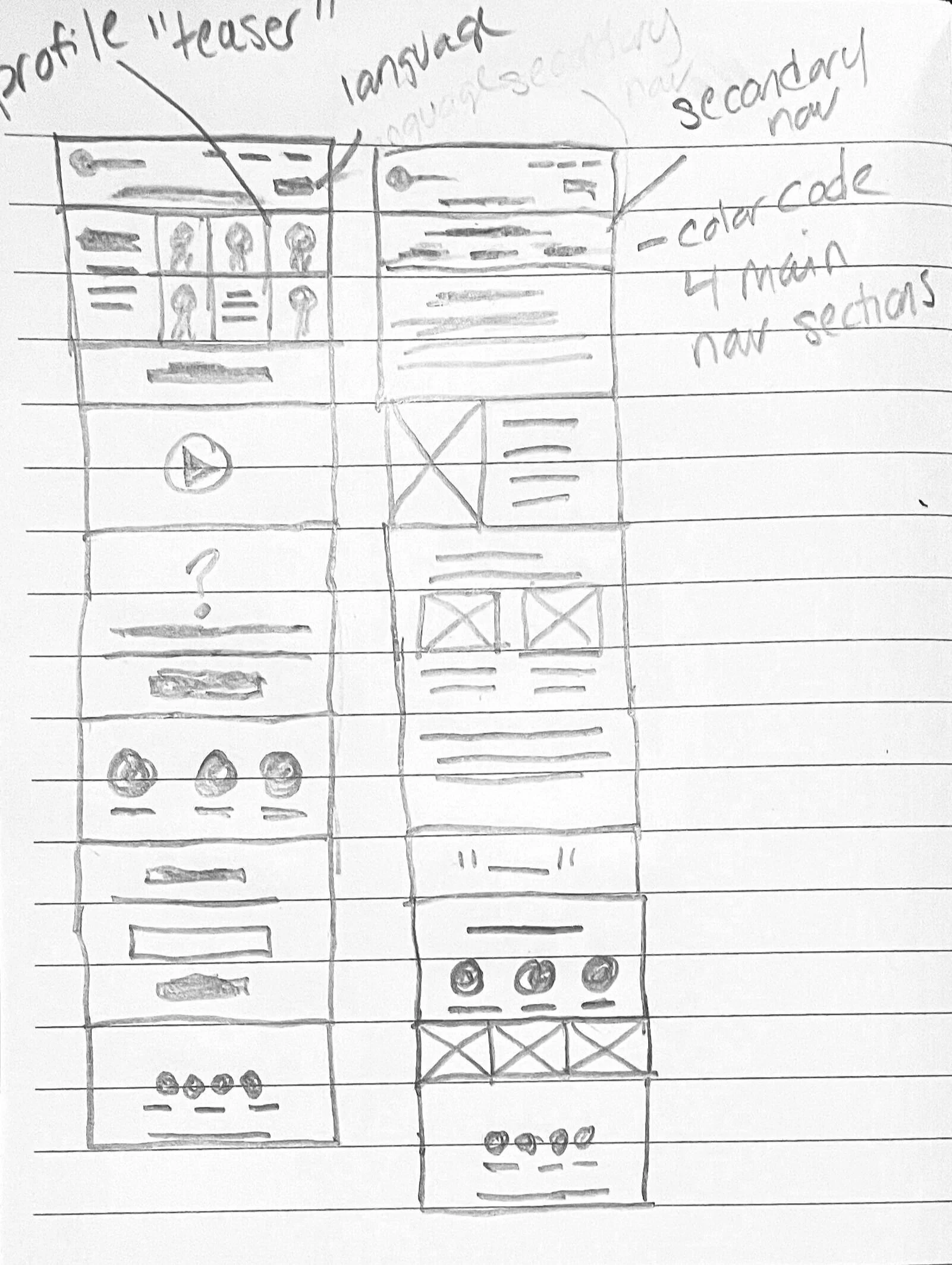
sketches
As part of my note taking, I do quick sketches in meetings to get a feel of the overall structure of the site.
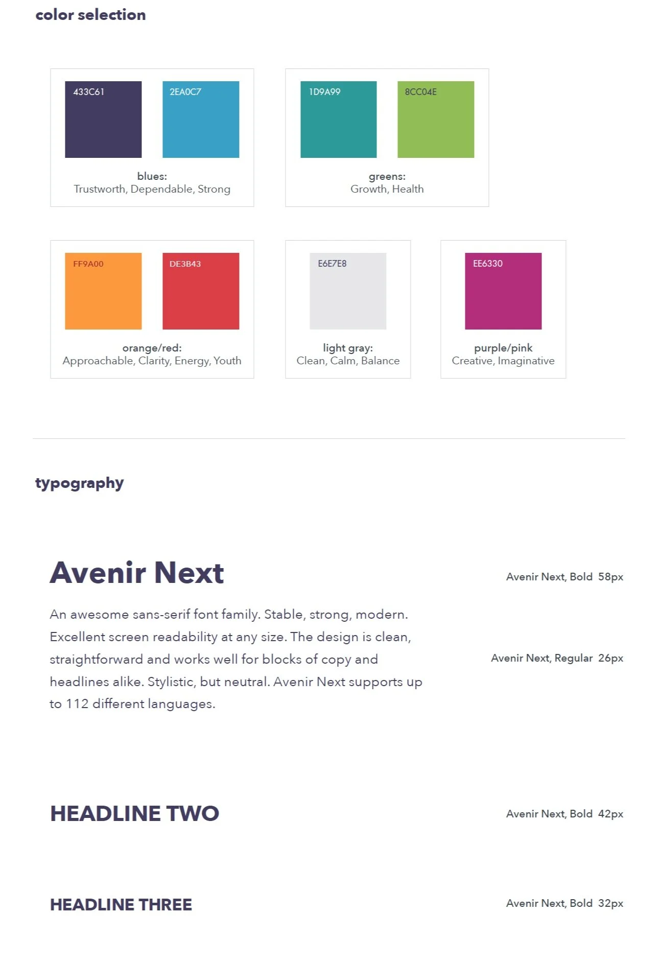
style guide
I create a style guide for the site, specifying fonts, colors and overall style. This helps the client and the developer in keeping the site consistent.
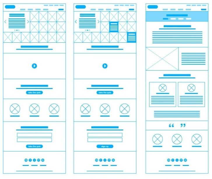
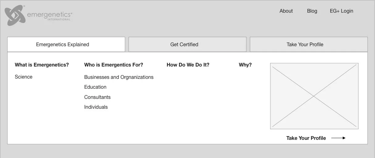
wireframes
I then take my notes to lo-fi wireframes to show the general structure and overall flow of the site. This also serves as a foundation so the client knows where we need copy and images.
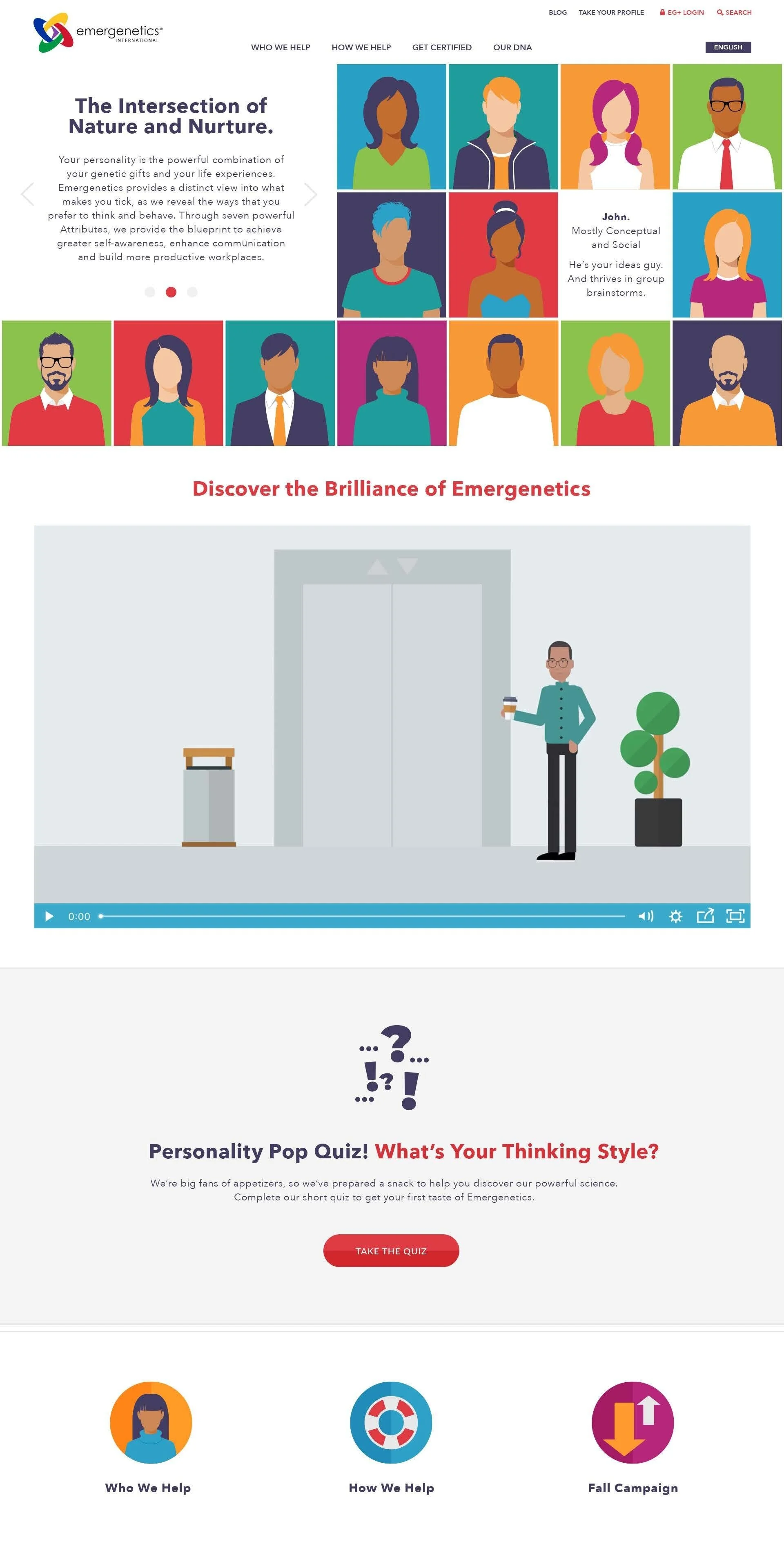
photoshop mockups
I then take my designs into photoshop, presenting mockups to the client before passing to development. This is a last “sign off'“ of sorts, for the client. After the final designs are passed to development, my role shifts to working with the development team. I make sure that they have all the assets they need and that the developed site maintains the integrity of the designs presented.
the final product
While most sites are done in phases, the initial launch is always an exciting time. I love the world of digital for this reason - you can build the infrastructure for what is to come, but still present a seemingly “finished” product to the world while you work on phase two. It was a wonderful opportunity to work with this team.